
Larry Bodine Law Marketing Blog
Bank Abandons Outdated Logo that "Looked Like a Law Firm"
 A Massachusetts credit union got rid of its old logo because it made them look like a law firm, which doesn't say much for law firm marketing logos.
When the officers at the First Citizens' Federal Credit Union in Massachusetts decided it was time for a new bank logo, they embarked on what can be a risky enterprise. Business people know that these things can go very, very wrong.
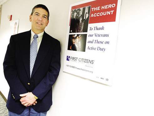
At right, First Citizens Federal Credit Union CEO Peter Muise stands next to a poster bearing the new company logo.
But some of the competition had already thrown down the redesign gauntlet. In particular, said Nora Ganim-Barnes, director of the Center for Marketing Research at UMass Dartmouth College of Business, Fall River Five Cents Savings Bank had recently transformed its name and its look to the new Bank Five.
First Citizens', meanwhile, was still using a maroon logo with script lettering dating back 30 or 40 years that President and CEO Muise says "looked like a law firm."
![]() Barnes said, "You look at the competitive environment and see whether or not you're looking tired and old and you need to shake things up a little bit. You do a competitive analysis. There are times when it is appropriate and times when it's inappropriate."
Barnes said, "You look at the competitive environment and see whether or not you're looking tired and old and you need to shake things up a little bit. You do a competitive analysis. There are times when it is appropriate and times when it's inappropriate."
The old lawfimmish logo is shown above.
http://blog.larrybodine.com/admin/trackback/132820
Tel: 630.942.0977