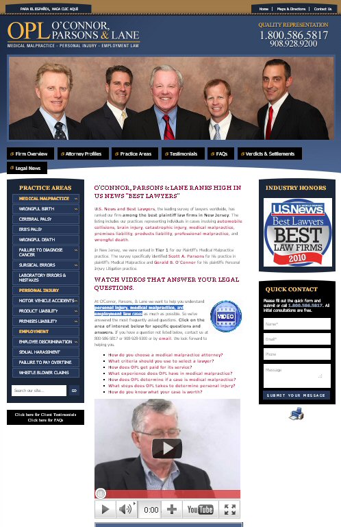
NJ Firm Shows Video Marketing at its Best
 A great example of a law firm with an effective online marketing initiative is O'Connor Parsons & Lane in Westfield, NJ. They have combined their website, testimonials, publishing and video to attract new clients. The five-lawyer firm focuses on personal injury, medical malpractice, and employment law cases, and presents an online picture that matches much larger corporate firms.
I'm proud to say I had a hand in putting it together. The idea was to present exactly the information potential clients want, so that their next step is to phone one of the lawyers.
The home page:
- Features people (not pictures of buildings or gavels)
- Displays a quick contact form, has the phone number and contact info in the top right corner
- Spells out their three primary services
- Shows their US News ranking (linked to their profile)
- Features several videos plus a client video testimonial.
The site features about 40 case histories, four client testimonials, real legal news (not partner announcements) and 45 video FAQs.
The lawyers publish timely news alerts such as O’Connor, Parsons & Lane Warns Job-Seekers About Rampant Hiring Discrimination.
The videos are what distinguish the firm. In each one a lawyer explains the law as opposed to talking about himself (which you see in a lot of other lawyer videos). For example:
- Greg Noble has a video on How does NJ Law Against Discrimination protect employees?
- Gerald B. O'Connor has one on How do you know what your case is worth? This is information potential clients want to know.
The firm caps it off with a YouTube video channel, with each video described in detail, linked back to the website, and described in numerous tags. Each one is short, from 30 seconds to 3 minutes. The videos also cover practical information that clients want, like:
- William Lane's What is cerebral palsy?
- Scott Parsons' What are damages in a medical malpractice case?
- Paul A. O’Connor's What is Wrongful Birth?
And those are just the high points. How would you improve their site?


It really does look excellent. The homepage is designed to give all the basic and most essential information, and it gives it in a pleasing way (prominent photo, video, and streamlined content). You want a visitor to click through your website and read more, but if they don't feel that it's absolutely NECESSARY, and they got what they needed from the homepage, then that's also an accomplishment.