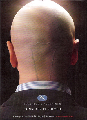
Dr. Evil Appears in Law Firm Marketing Ad
 When I first saw the law firm advertisement in American Lawyer magazine I had the following impressions:
1. Omigod! A law firm has used Dr. Evil from the the Austin Powers film series in an ad! How much did they have to pay to get comedy actor Mike Myers? Wait a minute...why would a law firm want to depict themselves as finger-biting terrorists who want to take over the world? Where is his cat Mr. Bigglesworth and his side-kick Mini-Me?
2. Then I looked closer and noticed that a creepy alien worm had wriggled under the man's skin. Omigod! A hideous larva has slithered subcutaneously next to his brain, just like in horror movies. Why would a law firm want to depict itself as a writhing invasive creature? What's the branding message?
3. Then I pulled away and notice that the bulging blue blood vessel resembled the filament in a light bulb. The man's head shape resembled a light bulb, kind of. Maybe the image was meant to suggest the "light bulb" that goes on in cartoons when a person has an idea. So how does that connect with the firm's tagline, "Consider it solved"? It appears to me that this man needs treatment at a varicose vein clinic.
Ahh those wacky Finns. It was an ad for Borenium & Kemppinen, attorneys at law in Helsinki and cities called "Espoo" and "Tempere." Established in 1911, B&K lost its mind in 2008 and is one of the largest law firms in Finland. For more bizarre images I recommend you visit their website. The flash video features flying insects hovering around Dr. Evil's head.
I am not making this up.


Larry - This one definitely goes into the "Museum of Badvertising." Yes, people will notice. But they will not buy.
It’s refreshing to see a law firm do something original and thoughtful, but looking at this ad in a vacuum does leave questions. The light bulb motif (as in "we have bright ideas") is much more apparent in the website piece.
Props to them for the branding video that takes the mind numbing law firm mission statement and packages it in something consumable by humans.
To some degree the intention may have been to generate discussion. It can be debated if that is a smart move in advertising. It really is a situation dependent answer.
I'd like to hear what advertising folks think?