3-Lawyer Firm's $50,000 Marketing Makeover Gets a Thumbs Up
 I was just on a webinar about the $50,000 Marketing Makeover that LexisNexis awarded to the 3-lawyer St. Louis firm of Case Rajnoha & Boudreau. I was also a judge in the competition that named the winner in January. Work was still proceeding in March and now the wraps are finally off of the website.
And it's a beaut. By several measures, LexisNexis did a great job:
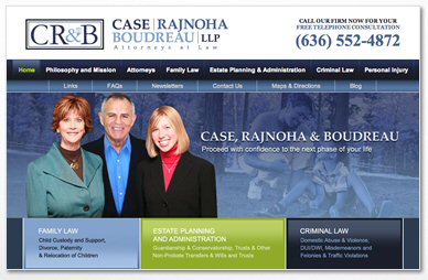
- The site features people and faces (including the ever-cute blond Meg Boudreau). There's not a trite gavel, column or blind justice in sight.
- The phone number is right at the top of the page, where it should be. Websites are supposed to generate leads.
- The site says callers get a free consultation. It's important to make this statement or else callers will think otherwise.
- I'm not a big fan of Flash, but theirs is pretty cool. The pictures of Sally Rajnoha, Joel Case and Meg remain stationary, while the blue background swishes by and changes. When you visit a lawyer bio, the picture of the person in question lights up brightly.
- The navigation is obvious, and you can immediately see what the firms three primary practices are.
- The site has videos, including one on divorce right on the home page. Videos help with search engine optimization and are one of the first things visitors look for. The video depicts typical clients, not the lawyers -- a smart move.
- The home page has a quick contact form, again, making it easy for visitors to contact the firm.
- There are social media links to Facebook and LinkedIn.
- The site has an FAQ page. This is always good, because you should answer common questions that your visitors have, so that all they need to do is call you. The info for clients continues in the "newsletters" section, which is actually a collection of articles.
- The firm has a blog, and clicking on the link to it brings up the latest posts on the home page.
- It has testimonials. A third-party endorsement is powerful marketing.
- The practice descriptions are written in plain English, not legalese, and explain the process involved in a criminal, divorce or other case.
- There's a sitemap, which also helps with search engines.
- As part of the makeover, Joel got his AV rating and Sally got her BV rating, and the site has a link to their Martindale-Hubbell bios.
- There are unique <title> and <meta> tags for each page, which helps with search engines.
And the site definitely works. During the webinar, Meg mentioned that she's been overwhelmed with all the leads the site produces. That's a problem every lawyer would love to have.


